DDN
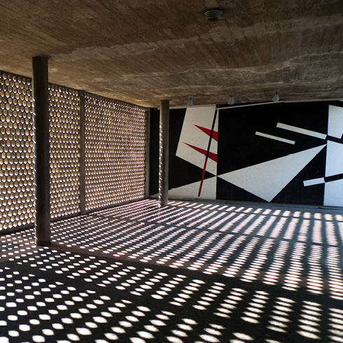
This two-building group reveals the intention of the campus’ first plan, which responded to a strict axis of symmetry that was later abandoned. Designed in rationalist language, unique themes can be seen, which will be developed in other constructions. Both similar yet different volumes, focused on the Clinical Hospital, create a false perspective and are linked to it by a pedestrian tunnel. Villanueva resorts to equilibrium by symmetry, repeating similar masses on either side of the axis, like the auditoriums, with their own identity but still contained by the building, and the office areas that unfold in independent wings connected to the central body. The exterior has smooth finish combined with elaborate windows and glass panels. The façades vary according to their orientation, avoiding repetition of perspectives. In one case, a continuous transparent surface predominates, in the other, niches, balconies and brise soleils. Both are examples of the disarticulation of the volumes into independent bodies, responding to a desire for artistic and functional expression. The accesses are decomposed into awnings or terraces, to the entrance and articulate the bodies. The exterior murals by Francisco Narváez (1905-1982) are noteworthy, as well as his sculptures Education and Science, on the buildings’ terraces. These complete the integration of the arts proposal. An additional level, was added to the south building, distorting the original compositional intentions.

planta

AMU-1

YPM-2


